Simple and Multiple Linear Regression: Predict Rental Prices in Berlin
Vinh Hung Le
Berlin is the capital and also the most populous city in Germany with more than 3.6 millions inhabitants (2019). People from all walks of life live, work, and study in this major metropolitan. Despite a developed real estate market, it is not simple to find an apartment that suits your budget and lifestyle.
In this project, we’ll work with a real estate dataset scraped by Corrie Bartelheimer from Immoscout24, the biggest real estate in Germany. It includes information about rental properties in all 16 states of Germany.
library(tidyverse)
library(cowplot)
library(reshape2)
library(colorspace)
library(ggridges)
font = "Avenir Next"
text_color = "#353D42"

germany_real_estate <- read.csv("/Users/huvi/Desktop/immo_data.csv")
Some questions:
What is the relationship between the base rent and other features, such as service, area, year of construction, and the availability of balcony, garden, kitchen, parking, etc?
Which feature has the most effect on the base rent?
Is there an interaction effect between features?
Can we predict future base rents based on the provided information?
1 Cleaning the Dataset
Let’s start with cleaning up the mess. We first need to choose interested features and remove some unnecessary variables, NA values, and duplicate observations.
berlin_real_estate <- germany_real_estate %>%
  filter(regio1 == "Berlin") %>%
  select(baserent = baseRent, service = serviceCharge, area = livingSpace, room = noRooms, year = yearConstructed,  parking = noParkSpaces, balcony, kitchen = hasKitchen, cellar, garden, interior = interiorQual, new = newlyConst, lift) %>%
  drop_na() %>%
  distinct()
The dataset contains the following features about rental properties in Berlin:
- baserent: base renting price (in euro)
- service: extra costs, such as internet or electricity (in euro)
- area: living space (in sqm)
- room: number of rooms
- year: construction year
- parking: number of parking spaces
- balcony: does the property has balcony?
- kitchen: does the property has kitchen?
- cellar: does the property has cellar?
- garden: is there a garden?
- interior: interior quality
- new: a new property or not?
- lift: is there a lift or not?
Now we need to check whether outliers exist in the dataset. There are generally two types of outliers:
- Outliers result from a mistake or error
- Outliers represent real observations, but look very different to others
The simplest way to detect an outlier is to make a scatterplot. First, take a look at the following plot between baserent and service
ggplot (berlin_real_estate, aes(x = baserent, y = service)) +
  geom_point(shape = 21, fill = "#D55E00", color = "white", size = 2) +
  scale_x_continuous(name = "base rent (euro)") +
  scale_y_continuous(name = "service (euro)") +
  theme(
    axis.ticks = element_blank(),
    axis.text = element_text(family = font, size = 11, color = text_color),
    axis.title = element_text(family = font, size = 11, color = text_color),
    panel.background = element_rect(fill = "white"),
    panel.grid.major = element_line(color = "#cbcbcb", size = 0.3),
    axis.title.x = element_text(margin = margin (t = 10)),
    legend.position = "none")
Here we can notice 5 outliers with the base rent price more than 10,000€ and 4 outliers with the service price more than 2,000€. These observations make it harder to figure out the overall pattern and may reduce the accuracy of the analysis as weell. We may discard them by setting thresholds: baserent < 10000 and service < 2,000.
Here’s what we have after removing outliers.
ggplot(filter(berlin_real_estate, baserent < 10000 & service < 2000), aes(x = baserent, y = service)) +
geom_point(shape = 21, fill = "#D55E00", color = "white", size = 2) +
scale_x_continuous(name = "base rent (euro)") +
scale_y_continuous(name = "service (euro)") +
theme(
axis.ticks = element_blank(),
axis.text = element_text(family = font, size = 11, color = text_color),
axis.title = element_text(family = font, size = 11, color = text_color),
panel.background = element_rect(fill = "white"),
panel.grid.major = element_line(color = "#cbcbcb", size = 0.3),
axis.title.x = element_text(margin = margin (t = 10)),
legend.position = "none")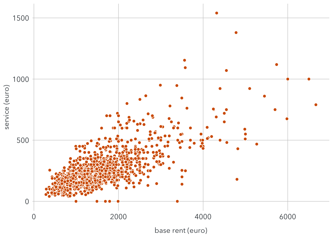 Now it is easier to notice that there seems to be a linear relationship between the base rent and service.
With the same procedure, we may filter observations with room < 25. Below graphs show before and after removing room outliers.
p1 <- ggplot(filter(berlin_real_estate, baserent < 10000), aes(x = baserent, y = room)) +
  geom_point(shape = 21, fill = "#D55E00", color = "white", size = 2) +
  scale_x_continuous(name = "base rent (euro)") +
  scale_y_continuous(name = "number of rooms") +
  theme(
    axis.ticks = element_blank(),
    axis.text = element_text(family = font, size = 11, color = text_color),
    axis.title = element_text(family = font, size = 11, color = text_color),
    panel.background = element_rect(fill = "white"),
    panel.grid.major = element_line(color = "#cbcbcb", size = 0.3),
    axis.title.x = element_text(margin = margin (t = 10)),
    legend.position = "none")

p2 <- ggplot(filter(berlin_real_estate, baserent < 10000 & room < 25), aes(x = baserent, y = room)) +
  geom_point(shape = 21, fill = "#D55E00", color = "white", size = 2) +
  scale_x_continuous(name = "base rent (euro)") +
  scale_y_continuous(name = "number of rooms") +
  theme(
    axis.ticks = element_blank(),
    axis.text = element_text(family = font, size = 11, color = text_color),
    axis.title = element_text(family = font, size = 11, color = text_color),
    panel.background = element_rect(fill = "white"),
    panel.grid.major = element_line(color = "#cbcbcb", size = 0.3),
    axis.title.x = element_text(margin = margin (t = 10)),
    legend.position = "none")

plot_grid(
  p1, NULL, p2,
  nrow = 1, align = 'hv', rel_widths = c(1, .04, 1, .04, 1))
berlin_adjusted <- berlin_real_estate %>%
  filter(baserent < 10000,
         service < 1500,
         room < 25,
         !interior %in% c("simple"))
2 Exploratory Data Analysis
Now let’s find out some interesting facts about the dataset. Start with the distribution of the base rent.
ggplot(berlin_adjusted, aes(x = baserent)) +
geom_histogram(fill = "#56B4E9", binwidth = 400, colour = "white") +
stat_bin(binwidth = 400, aes(y = ..count.., label=..count..), geom="text", family = font, color = text_color, size = 3.5, vjust = -0.5) +
geom_vline(xintercept = mean(berlin_adjusted$baserent), size = 0.5, linetype = 2) +
geom_curve(aes(x = 2100, xend = 1700, y = 280, yend = 275),
color = text_color,
size = 0.2,
arrow = arrow(length = unit(0.01, "npc"))) +
ggplot2::annotate("text", x = 2500, y = 270,
label = "Averaged rent: 1586€",
family = font,
color = text_color,
size = 3.5) +
scale_y_discrete(expand = c(0,16)) +
scale_x_continuous(expand = c(0,0), name = "base rent (euro)", breaks = seq(0,6000,500))+
theme(
panel.background = element_blank(),
axis.ticks = element_blank(),
axis.text = element_text(family = font, color = text_color, size = 11),
axis.title = element_text(family = font, color = text_color, size = 11)
)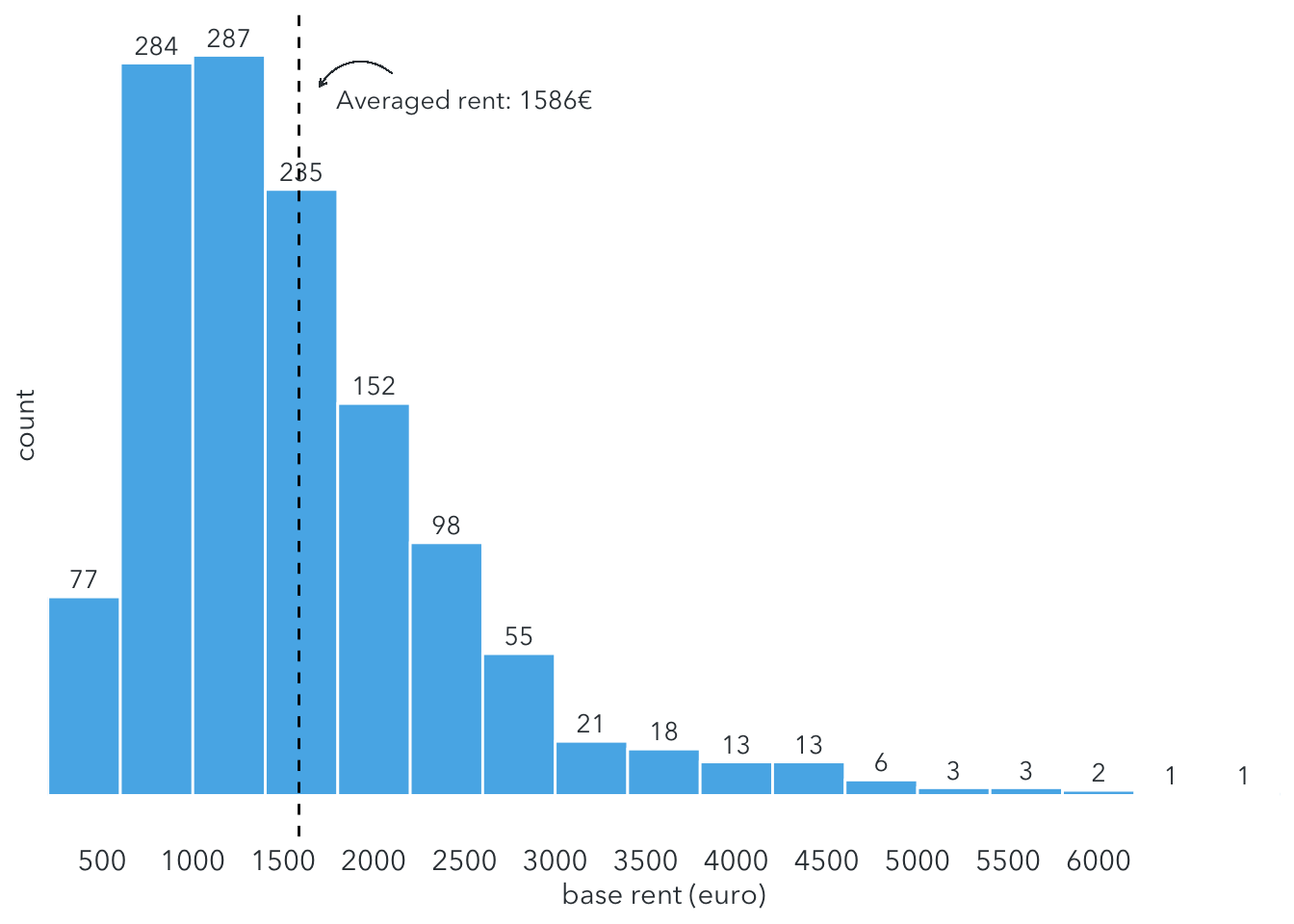 The histogram shows most people have to pay between 500 and 3000 €/month for rental properties in Berlin range. The averaged base rent is around 1986€/month.
But that’s not the final expense. How much do they still have to pay for extra costs, such as heating, electricity, or interset? Let’s take a look at the distribution of service.
ggplot(berlin_adjusted, aes(x = service)) +
geom_histogram(fill = "#56B4E9", binwidth = 100, colour = "white") +
stat_bin(binwidth = 100, aes(y = ..count.., label=..count..), geom="text", family = font, color = text_color, size = 3.5, vjust = -0.5) +
geom_vline(xintercept = mean(berlin_adjusted$service), size = 0.5, linetype = 2) +
geom_curve(aes(x = 400, xend = 300, y = 400, yend = 410),
color = text_color,
size = 0.2,
arrow = arrow(length = unit(0.01, "npc"))) +
ggplot2::annotate("text", x = 450, y = 385,
label = "Averaged service: 262€",
family = font,
color = text_color,
size = 3.5) +
scale_y_discrete(expand = c(0,25)) +
scale_x_continuous(expand = c(0,0), name = "service (euro)", breaks = seq(0,2000,200))+
theme(
panel.background = element_blank(),
axis.ticks = element_blank(),
axis.text = element_text(family = font, color = text_color, size = 11),
axis.title = element_text(family = font, color = text_color, size = 11)
)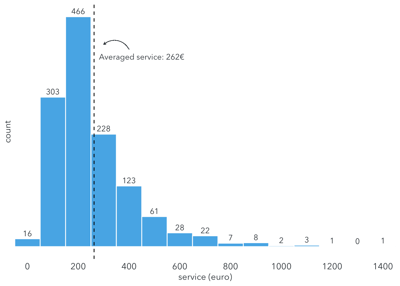 The service price mainly ranges between 100 and 400€/month with the average of around 260€/month.
How about the living space?
ggplot(berlin_adjusted, aes(x = area, y = ..count..)) +
geom_density_line(fill = "#D55E00", color = "darkorange", alpha = 0.5, bw = 4, kernel = "gaussian") +
scale_y_continuous(expand = c(0,0), name = "scaled density") +
scale_x_continuous(expand = c(0,0), name = "area (sqm)", breaks = seq(0, 400, 50)) +
geom_vline(xintercept = mean(berlin_adjusted$area), size = 0.5, linetype = 2) +
geom_curve(aes(x = 125, xend = 104, y = 13, yend = 14),
color = text_color,
size = 0.2,
arrow = arrow(length = unit(0.01, "npc"))) +
ggplot2::annotate("text", x = 155, y = 12.5,
label = "Averaged size: 100 sqm",
family = font,
color = text_color,
size = 3.5) +
coord_cartesian(clip = "off") +
theme(
panel.background = element_blank(),
panel.grid.major.y = element_line(color = "#cbcbcb", size = 0.2),
panel.grid.major.x = element_line(color = "#cbcbcb", size = 0.2),
axis.ticks = element_blank(),
axis.text = element_text(family = font, color = text_color, size = 10),
axis.title = element_text(family = font, color = text_color, size = 11))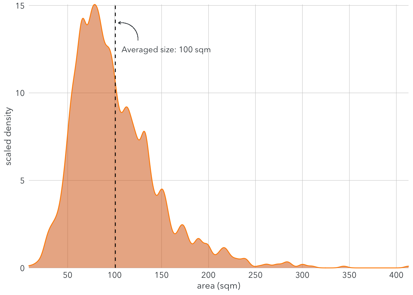 The density plot shows that the area of most rental rents range between 50 and 150 sqm.
For interior decoration, there are three options: normal, sophisticated, and luxuty. Let’s see which option is more prevalent in Berlin rental properties.
berlin_interior <- berlin_adjusted %>%
group_by(interior) %>%
summarize(
count = n()/10)
waffle::waffle(
berlin_interior,
rows = 5,
xlab = "1 square = 10 units"
)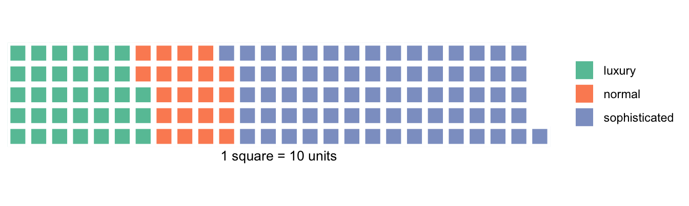 The number of rental properties labelled with sophisticated dominates, even larger than the total of normal and luxury interior.
3 Modelling
Before starting with modelling, we need to transform some categorical into dummy variables for regression.
berlin_final <- berlin_adjusted %>%
  mutate(
    balcony = as.numeric(balcony),
    kitchen = as.numeric(kitchen),
    cellar = as.numeric(cellar),
    garden = as.numeric(garden),
    new = as.numeric(new),
    lift = as.numeric(lift),
    interior = case_when(
      interior == "normal" ~ 0,
      interior == "sophisticated" ~ 1,
      interior == "luxury" ~ 1
    )
  )
Next, split the dataset into two parts: one for training and one for prediction.
set.seed(1)
train <- sample(nrow(berlin_final), 700)
berlin_train <- berlin_final[train,]
berlin_test <- berlin_final[-train,]
Let’s start with the correlations between each pair of features. 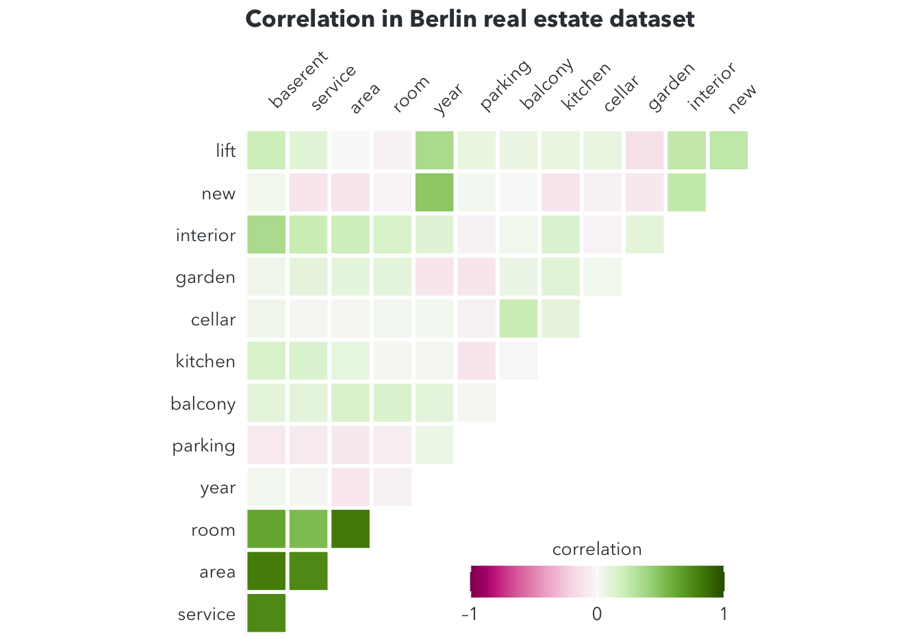 The corrolegram shows very strong correlations between the base rent and other features, especially service, area, room, and interior.
3.1 Model 1: Simple linear regression
First, let’s take a look at the scatterplot between baserent and area.
ggplot(filter(berlin_train), aes(x = area, y = baserent)) +
geom_point(shape = 21, fill = "#0072B2", color = "white", size = 2) +
scale_x_continuous(name = "area (sqm)") +
scale_y_continuous(name = "baserent (euro)") +
theme(
axis.ticks = element_blank(),
axis.text = element_text(family = font, size = 11, color = text_color),
axis.title = element_text(family = font, size = 11, color = text_color),
panel.background = element_rect(fill = "white"),
panel.grid.major = element_line(color = "#cbcbcb", size = 0.3),
axis.title.x = element_text(margin = margin (t = 10)),
legend.position = "none")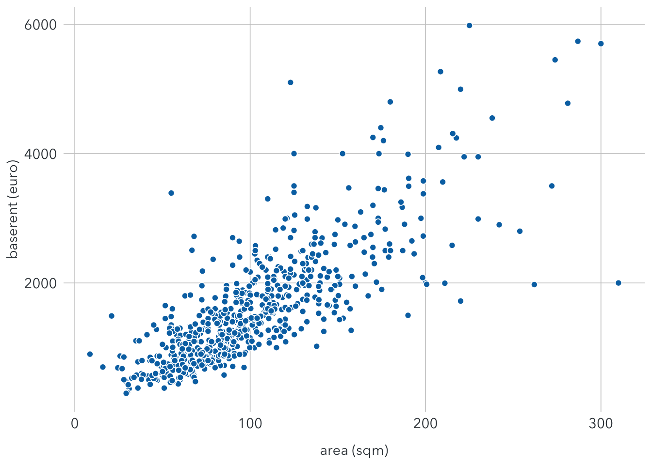 It shows that base rent and area seem to have a linear relationship. This means properties with more living space tend to have higher base rents. The linear regression for this relationship can be shown as:
\(baserent = a + b*area + ε\), with ε is the error term, which includes other features that affect the base rent.
We can use the lm() function to find a and b.
lm1 <- lm(baserent ~ area, data = berlin_train)
summary(lm1)
##
## Call:
## lm(formula = baserent ~ area, data = berlin_train)
##
## Residuals:
## Min 1Q Median 3Q Max
## -2892.6 -313.7 -85.6 239.6 3163.8
##
## Coefficients:
## Estimate Std. Error t value Pr(>|t|)
## (Intercept) -8.3640 49.4648 -0.169 0.866
## area 15.8095 0.4452 35.514 <2e-16 ***
## ---
## Signif. codes: 0 '***' 0.001 '**' 0.01 '*' 0.05 '.' 0.1 ' ' 1
##
## Residual standard error: 539.7 on 698 degrees of freedom
## Multiple R-squared: 0.6437, Adjusted R-squared: 0.6432
## F-statistic: 1261 on 1 and 698 DF, p-value: < 2.2e-16The results show that both coefficients are statistically significant. The model now becomes:
\(baserent ≈ -8.3640 + 15.8*area\)
This means an increase of 1 sqm in the area may increase the base rent up to 15.8€. However, the accuracy of the model is quite low simply because the base rent can be determined by many other factors.
The residual standard error (RSE) is the estimate of the standard deviation of ε. In this case, it means observed base rents deviate from the true value by around 539.7, on average. With the mean value of baserent around 1592€, the percentage error is 539.7/1592 ≈ 34%.
The R-squared is 0.6437, meaning that the model can explain around 64% of the variance.
The graph below show the regression line with the standard error band.
ggplot(filter(berlin_train), aes(x = area, y = baserent)) +
  geom_point(shape = 21, fill = "#0072B2", color = "white", size = 2) +
  stat_smooth(method = "lm", color = text_color, size = 0.5) +
  scale_x_continuous(name = "area (sqm)") +
  scale_y_continuous(name = "baserent (euro)") +
  theme(
    axis.ticks = element_blank(),
    axis.text = element_text(family = font, size = 11, color = text_color),
    axis.title = element_text(family = font, size = 11, color = text_color),
    panel.background = element_rect(fill = "white"),
    panel.grid.major = element_line(color = "#cbcbcb", size = 0.3),
    axis.title.x = element_text(margin = margin (t = 10)),
    legend.position = "none")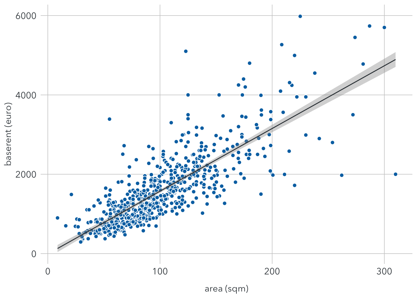
3.2 Model 2: Collinearity
Now let’s add a another feature room into the model.
lm2 <- lm(baserent ~ area + room, data = berlin_train)
summary(lm2)
##
## Call:
## lm(formula = baserent ~ area + room, data = berlin_train)
##
## Residuals:
## Min 1Q Median 3Q Max
## -2965.15 -304.23 -83.49 242.55 3129.49
##
## Coefficients:
## Estimate Std. Error t value Pr(>|t|)
## (Intercept) 16.9313 58.9697 0.287 0.774
## area 16.2667 0.7311 22.249 <2e-16 ***
## room -23.6147 29.9516 -0.788 0.431
## ---
## Signif. codes: 0 '***' 0.001 '**' 0.01 '*' 0.05 '.' 0.1 ' ' 1
##
## Residual standard error: 539.8 on 697 degrees of freedom
## Multiple R-squared: 0.6441, Adjusted R-squared: 0.643
## F-statistic: 630.6 on 2 and 697 DF, p-value: < 2.2e-16The results indicate that room is not a statistically significant variable. This can be explained by a phenomenon called collinearity. It occurs when two variables are highly linearly related. In this case, we may think that properties with more room tend to have larger living areas.
3.3 Model 3: Multiple linear regression
Now we regress the baserent on all features of the dataset.
lm3 <- lm(baserent ~ ., data = berlin_train)
summary(lm3)
##
## Call:
## lm(formula = baserent ~ ., data = berlin_train)
##
## Residuals:
## Min 1Q Median 3Q Max
## -2291.9 -256.4 -48.6 181.9 2516.9
##
## Coefficients:
## Estimate Std. Error t value Pr(>|t|)
## (Intercept) 3.5579 1033.9914 0.003 0.99726
## service 1.4856 0.1707 8.702 < 2e-16 ***
## area 10.6220 0.8768 12.115 < 2e-16 ***
## room 33.3269 27.1021 1.230 0.21924
## year -0.2360 0.5274 -0.447 0.65470
## parking -2.9201 3.4022 -0.858 0.39102
## balcony -74.1553 61.6560 -1.203 0.22950
## kitchen 116.6264 43.0636 2.708 0.00693 **
## cellar 58.4286 43.8037 1.334 0.18269
## garden -32.4150 39.9224 -0.812 0.41710
## interior 308.2498 53.7373 5.736 1.45e-08 ***
## new 104.4353 46.7379 2.234 0.02577 *
## lift 219.6438 44.1091 4.980 8.07e-07 ***
## ---
## Signif. codes: 0 '***' 0.001 '**' 0.01 '*' 0.05 '.' 0.1 ' ' 1
##
## Residual standard error: 470.8 on 687 degrees of freedom
## Multiple R-squared: 0.7331, Adjusted R-squared: 0.7285
## F-statistic: 157.3 on 12 and 687 DF, p-value: < 2.2e-16With more features included, RSS is significantly reduced and R-squared is also much higher. Statically significant variables include service, area, kitchen, interior, new, and lift.
4 Prediction
Once we have done with modelling, it’s time to use the model for predicting the base rent in the test dataset. From a list of features as inputs, we can calculated predicted prices.
The following dataframe shows the actual and predicted prices of the test dataset, using 3 models above:
pred.lm1 = predict(lm1, newdata = berlin_test)
pred.lm2 = predict(lm2, newdata = berlin_test)
pred.lm3 = predict(lm3, newdata = berlin_test)

prediction <- data.frame(berlin_test$baserent, pred.lm1, pred.lm2, pred.lm3) %>%
  rename(
    actual_price = berlin_test.baserent,
    predicted_model1 = pred.lm1,
    predicted_model2 = pred.lm2,
    predicted_model3 = pred.lm3
  )
prediction
To measure the accuracy of this regression model, we may calculate the root-mean-square error (RMSE). This metric simply calculates the average error of all predictions.
RMSE1 = sqrt(mean((prediction$actual_price - prediction$predicted_model1)^2))
RMSE2 = sqrt(mean((prediction$actual_price - prediction$predicted_model2)^2))
RMSE3 = sqrt(mean((prediction$actual_price - prediction$predicted_model3)^2))

data.frame(RMSE1, RMSE2, RMSE3)
Model 3 has the smallest RMSE. So if we have to choose one, this should be a suitable option. This does not necessarily mean it is the best model for predicting future observations.
To increase the accuracy of prediction, we need to:
- Increase the sample size by collecting more data on rental properties in Berlin
- Include more relevant features linked to the base rent prices, such as the neighborhood, number of supermarkets or schools around, distance to the nearest bus or train station, etc.